INSPIRATION: ART & DESIGN: NORWICH CASTLE REBRAND
INSPIRATION: ART & DESIGN: NORWICH CASTLE REBRAND
I love it when a great design has been expertly applied and I haven’t seen a better example of this than the redesign for Norwich castle for quite some time. The starting point of a very simple but highly effective motif implemented and utilized so expertly over the different applications is a visual joy to behold. I would have absolutely loved to be a part of something like this. Here’s the things I love the most about this project:
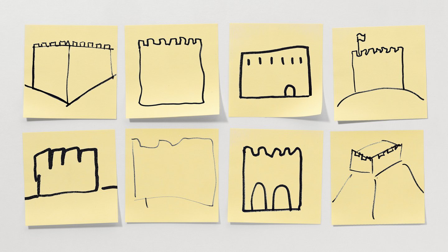
It’s so simple it’s genius and the creation of the seemingly simple shape has been worked out meticulously to make it the best it can look.
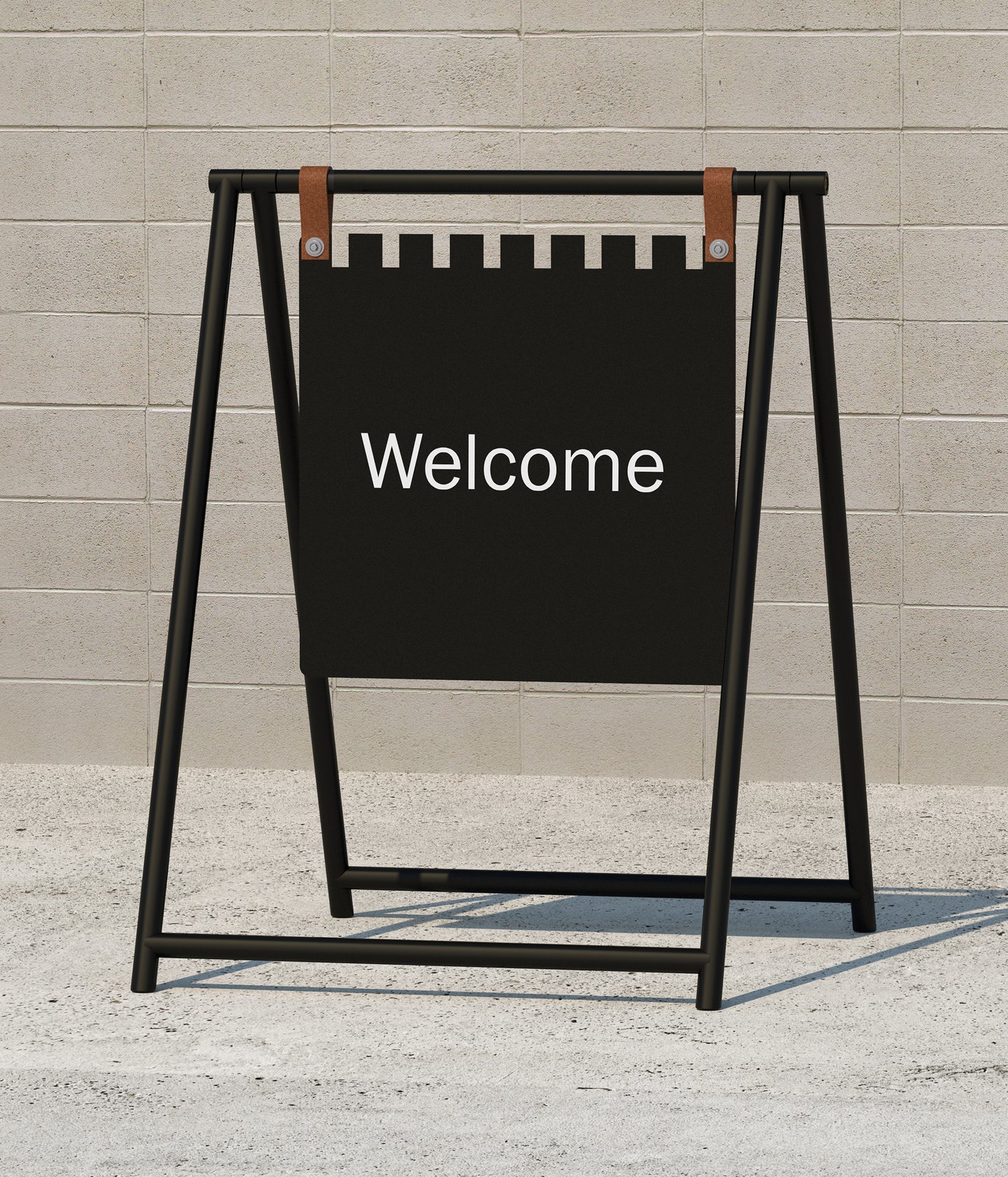
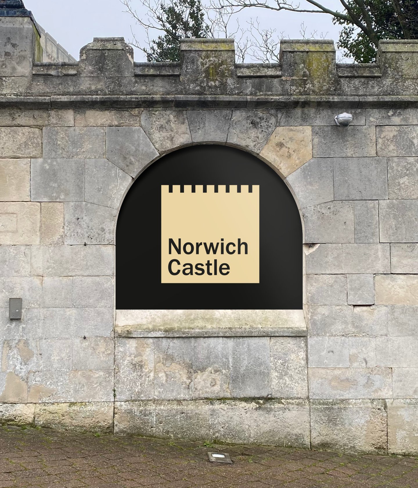
The simple shape lends itself to the signage perfectly, using the simple square but with the cutout at the top to make it something unique and special.
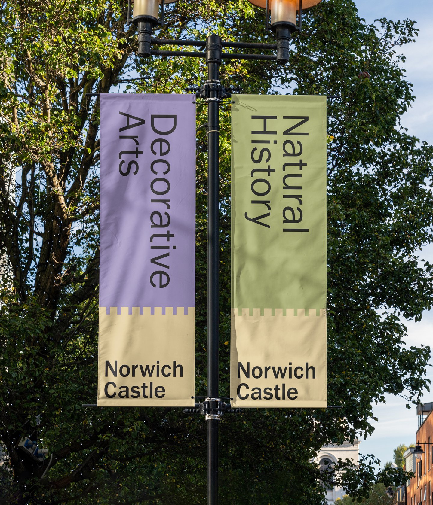
The banners work perfectly with the colour scheme that matches the castle colour and just the right amount of space for each element to stand out on its own.
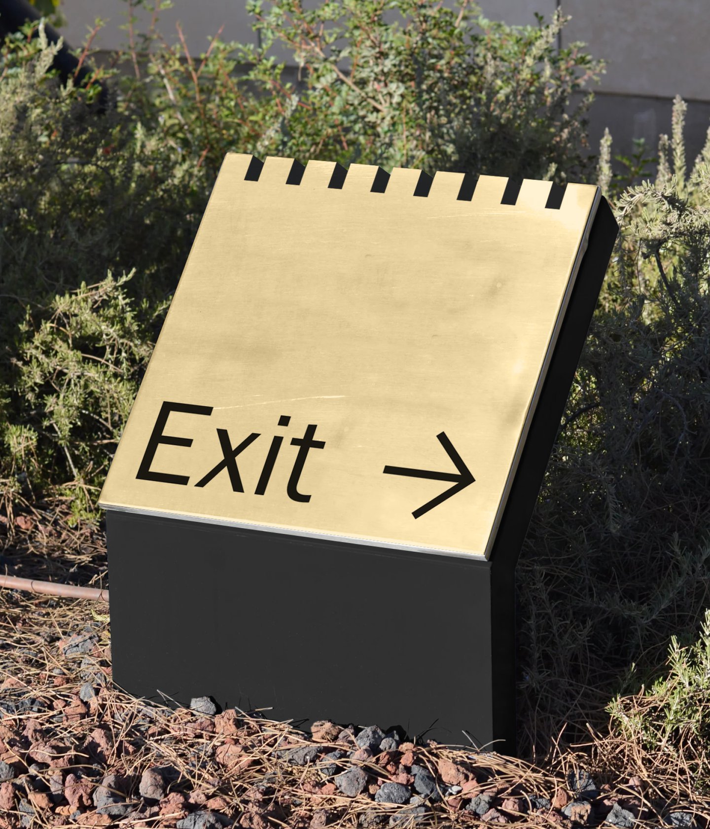
The angle and cut out of the metal for the exit sign is something special, it’s the ideal metal to match the logo and it’s perfectly executed.
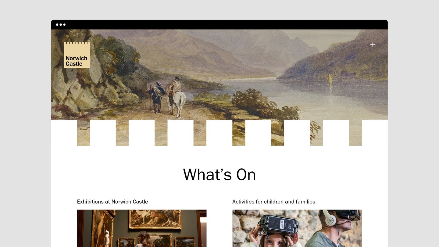
The way the shape has been implemented into the website is a really special piece of design. There’s a hundred different ways they could have done this, the designers have picked the most interesting.
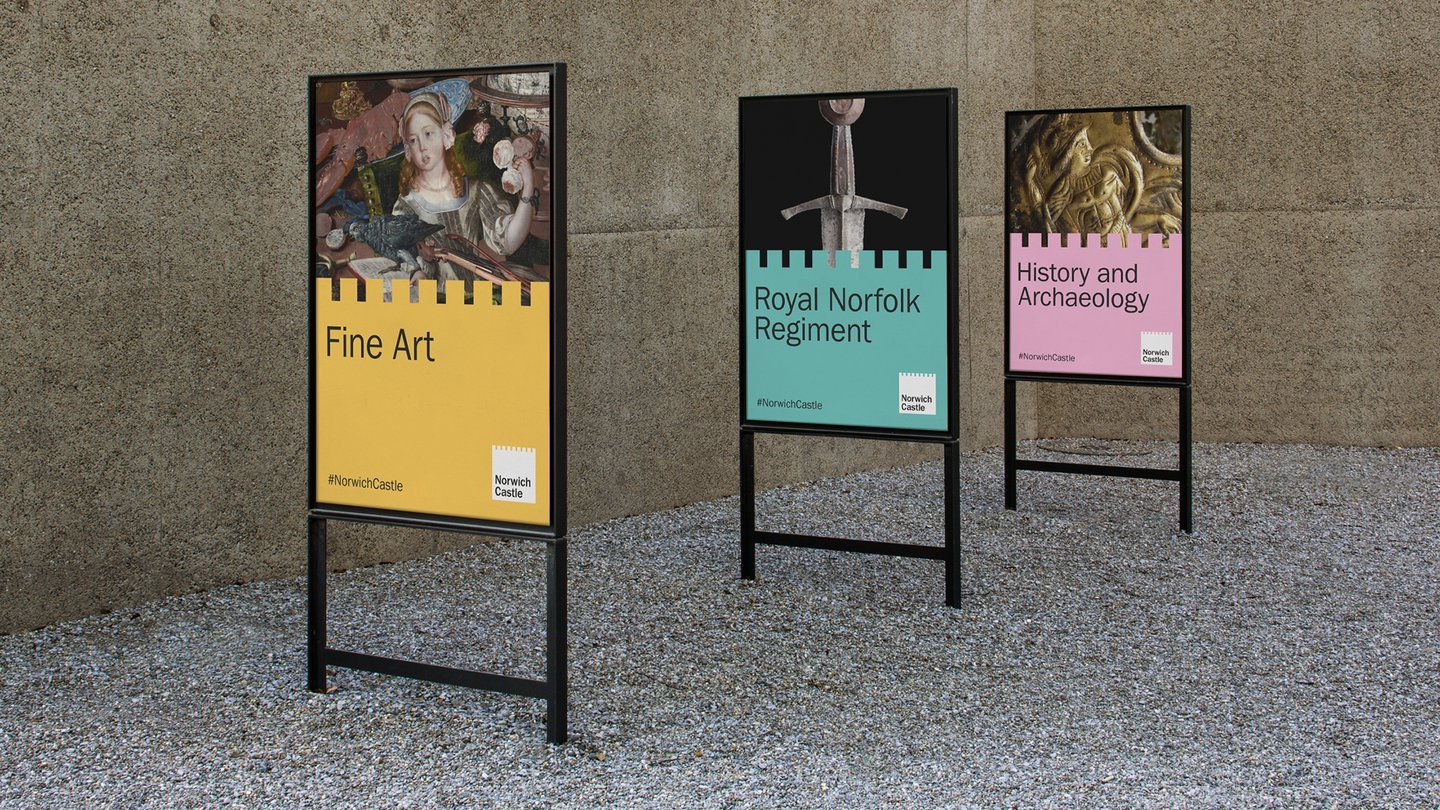
The way the posters are set up are a half way split between an image and the castle logo but with the colour change for the castle, a mix between the way the website has been set up and the banners, and a lovely bold choice that mixes the history of the castle with modern design.
Can you tell I love it all? Please visit the original article here for more information about the design process and here for the design team that came up with the wonderful rebrand.


